Pages

Friday, March 6, 2020

Paper Pulled Page


It has been a long time since I have blogged, but I was trying something new and decided to document my process.
I had seen a story about the artist Mark Bradford and was fascinated by his work.
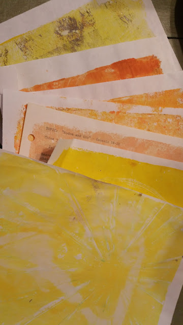
I started by gathering some Gelatin prints. These were all on copy paper or thin book pages 

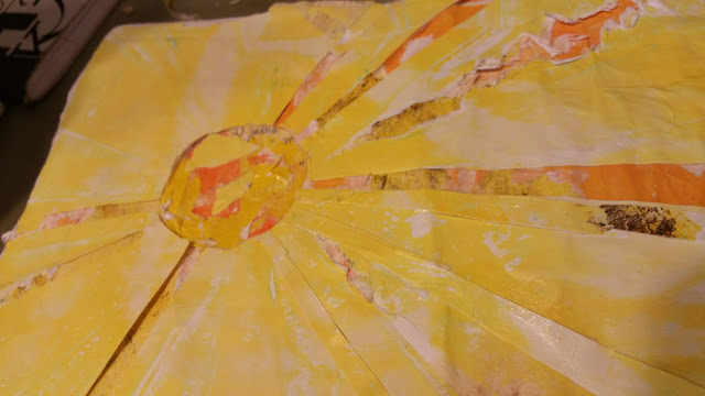
I glued the papers in layers and then used an Exacto knife to cut and peel back layers

Here's what it looked like after I peeled back layersand reglued some pieces back on. It was hard to distinguish the layers.

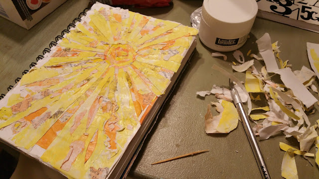
Here's a look at the messy process


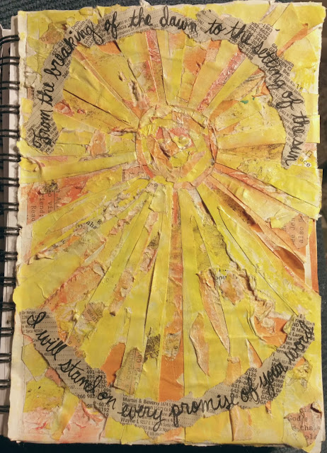
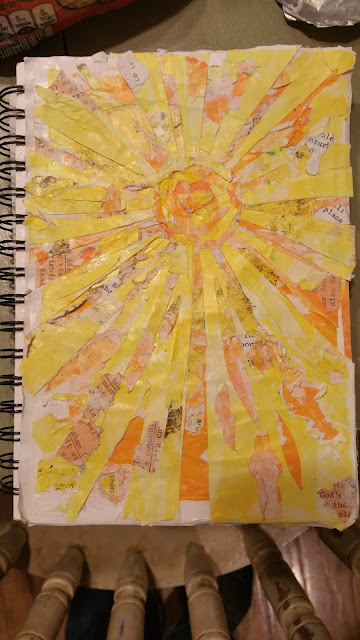
My final look. I added some Gelatos to define the layers more. I wrote my sentiment on phone book page and tore it out

Saturday, May 18, 2019

Magazine Image Transfer with Gelatin Plate


Magazine Image Transfer with Gelatin Plate

 Many people have done tutorials on image transfers so I am adding this mainly because of lessons learned along the way. My main tip is to keep your layers really thin...like almost transparent. Also, the quality of the magazine is important; you are looking for high gloss. Additionally, you want a lot of contrast between the image and background.


These are from Marie Claire magazine.  I am using the bottom one in the following pictures.

Gathe all your supplies: gelatin plate, dark paints for 1st coat light for the 2nd, brayer, some items to add texture if you desire, paper for printing and brayering off


Even this small amount of paint required a bit of brayering off to get the paint a thin enough coating. I usually use a couple of colors but they all need to be dark.

As soon as you have that very thin coat lay your image face down. Quickly rub lightly to make sure all of the paper has made contact. You aren't trying to massage, just get air bubbles out and have all the ink touching paint. Pull right off. Allow the paint to dry before the next step. This goes much quicker if your coat was thin enough. 

I used about the same amount of paint for the second coat but in light colors this time. Add texture to non-image areas...I keep my original.image in view to see where there are blank areas. You have a great thin coat if you start to see the image through this layer.


Lay your paper down and this time you want to really give a good rub to get all the paint to pull.

I lost a lot of this one. I think I let the paint sit too long before pulling 


Lost detail on the right side but still a cool print.


I really like the way this one turned out. Lots of great contrast in the original image.


Friday, October 6, 2017

BINGO!

I had so much fun playing around with the Acrylic Distress Technique in making this BINGO card. Here's the process! Sorry the photos are bad....night photos of some and rainy day for the finished piece!


I took a piece of Kraft cardstock and embossed with the Tim Holtz BINGO ef. I then used a foam brush to add Pumpkin Chalk Paint.

Once that was dry, I went to town with a sanding block and emery board to remove paint from the raised areas. I also intentionally, and sometimes mistakenly, distressed the edges.
I then used a blending tool to sponge Distress Ink over the piece. I then used a damp washcloth to take off the excess ink. I LOVE the look of the finished technique. 
My finished card. Here's the details: 
Stamps: So Very, Print Pattern, TH Playful Journey
Paper: Kiwi Kiss, Kraft, White, Core Early Espresso
Paper Size: A2
Ink: Early Espresso, Versamark, Distress Vintage Photo
Accessories: Copper and Clear ep, Sanding block &emery board, Distressing Tool, Pumpkin chalk paint, Heart to Heart punch, glue dot, TH Bingo ef, foam circles, vinegar bottle seal, ticket stub
Techniques: Dry Embossing, Acrylic Distress, Distressing, Embossing, Crumpling
Another view

Here's a closeup of the card. 

Tuesday, September 19, 2017

Embossed Wrinkles

     We have had our Celebrate Recovery Ministry up and running for just two weeks now and we've had our first really hard circumstance. We have ladies coming from a local recovery home and they had a death Sunday of a recent graduate from the program. It has the ladies at the home, and those who work there and in other recovery groups all really shaken. Me too! As is my pattern (along with some not as fruitful coping mechanisms) I took my sadness down to the stamping studio. 
     Sabrina offered a technique challenge yesterday for the Ways to Use it Challenge. We were to add watercolor to tissue paper then wrinkle it, glue it to cardstock retaining the wrinkles and emboss the raised, wrinkled areas. Well, at the end of the summer my kids and my foster grandson tie dyed T shirts. That involved lots of paper towels and dye and I just couldn't toss all those cool pieces of toweling! 


Here are my paper towels
I pulled apart the two plies and glued the darker piece down onto plain white card stock with Elmer's glue retaining the wrinkles.
Here's the first round of embossing by running a Versamark pad over the raised areas and sprinkling pewter embossing powder over it.

Went back and added more Versamark and ep

Cut the flowers and a branch and used that over a piece of a Gelli print


I diecut several dragonflies to use


Kept it very simple on this one

Shook a silver Sharpie over the punched black circles in the bg

Used a Gelli print for the solid dragonfly and overlaid a plain white

This is a really fun and easy technique that makes great bg pieces or pieces to diecut!

Saturday, March 4, 2017

Stained Glass Inspired Bible Journal Page


Today's Inspiration Challenge at splitcoaststampers took us to a Pinterest board full of gorgeous art journaling pages in moleskin journals. I am going to follow to use more inspiration later. I chose this beautiful stained glass inspired spread titled Stained glass_Drawing, 2016_Mariasun Salgado

Here's my final product. I went with brighter colors to match the opposing page which I'd already done. 
Here are my original scribbled shapes in the same Gelato colors as on the other page.

I took my aqua pen and activated the Gelatos with water to spread out the colors. I also added some white and black Gelato blocks.

I toned down the brightness of the colors to more match the look of the inspiration piece by pulling paint onto my aqua pen from my gold Gelato crayon. I did the same with my Black Gelato to add the framing around the blocks of color

I'm pretty sure this was the final look before I started my lettering

I had some trouble with the lettering. It is the downside to prepping pages I think. The grit of the page makes it difficult to letter in ink. I had a couple of fails with my calligraphy pen and a Sharpie....the beauty of prepped pages is that you can just wipe off mistakes with a water. I ended up writing first in a Black Inktense pencil (also added more shading around the blocks). I then went over that with a black gel pen and on the uppercase letters on the right side, I used my Elegant Writer calligraphy pen. I smeared on some white Sharpie to add highlights in the color blocking and to intensify the white blocks a bit. 

Friday, February 24, 2017

Tough Text Transfer

I was so excited when I saw today's Mixability Challenge today at splitcoaststampers. Polly challenged us to use a technique that transfers text onto our projects. I picked up Claudia Helmuth's book on collage a little while ago and I've read it through 2 times and have been chomping at the bit to give some of the techniques a go. Lucky for me, one of the techniques was the very one from the challenge today! I pulled out a thrift store wood plaque to start. I began by putting a coat of Aqua acrylic paint onto the plaque.
I then mixed some black and dark blue paint together and thinned with some water to create a glaze (Claudia technique #2). I painted that over the whole piece then used a paper towel to wipe off most of it. 

I used Matte Gel Medium with a scraper to add the text transfer. Gel onto plaque, paper over gel, burnish well with scraper then peel off paper.
I glued some words that I tore out of the same article. We had a series of 4 deaths in our small community right around Christmas and the community was really rocked. I had an article from our small town paper and used that for this piece.

I didn't like how white the paper looked so I took my toweling from removing the glaze to dab some paint over the top. 

I saved the wand from a used up mascara and scraped some bronze paint around the piece.

Here's the final outcome with lots of extra stuff collaged around. I think I still need to work with Claudia's editing process a bit more. I always seem to end up with a more is more mindset instead of her approach of, "does this need to be there?"

I did some more transfer to the sides and other "bare spots" at the end of my piece as I'd covered up a lot of the transfer with "stuff" I went back and added some of the original aqua color to lighten up some areas and I used a transparent brown gel on others to darken and add some shading. My tree is stamped on vellum in Stazon and colored with markers. I had intended to use the piece front side up, but ended up with it backwards to have more vibrancy from the colors since the bg piece was dark.  

Friday, February 10, 2017

Share The Love

I am really enjoying Bible Journaling. This one features a lot of stenciling using sprays and Metallic Lustre Paste as well as some recycled cut outs from a coffee sleeve and flyer.


I sprayed Distress Ink Spray-Picked Raspberry through the stencil. I then flipped that stencil down onto another sheet of paper to use that "extra" ink for another purpose later. I then sprayed Heidi Swapp Blush Color Spray through that and then laid that back onto my Bible page to get the blush onto the page.

I was experimenting with prepping the back side of the page to see if that would help with bleed through but alas, it didn't work.


Used Micron pens and Gel pens to accent the stencils and add my verses. A glue pen made a way to add accents with micro beads.

My Starbucks accents. I traced around the heart with a glitter pen and around the cups with a Mambo marker.

Lots of gel pen and smeared inks on this side of the page.