Pages

Wednesday, November 16, 2016

Spirograph Spraying

     I may be dating myself here, but who remembers playing with Spirograph sets? I had lots of fun making the designs with these so of course there's one in my stash of kid's toys. None of my kids every appreciated this toy as much as I did. When I saw today's sketch at splitcoaststampers sketch challenge I thought it would be fun to try out the spirographs as a mask with spray. 
I laid my Spirograph circles down and then laid a sheet of scrap paper to cover the rest of the card. I then sprayed with Distress Ink Spray Stain-Broken China here

I moved the sheet to the other side and sprayed again in the second color-Picked Raspberry

I gave the whole card a spray with Heidi Swapp sheer Color Shine Spray and embossed my sentiments in colored ep.
Stamps: Happiest Birthday Wishes
Paper: White
Paper Size: A2
Ink: Versamark
Accessories: Distress Spray Stain: Broken China, Picked Raspberry, Wild Honey Tempting Turquoise and Melon Mambo ep
Techniques: Masking

Here's a simpler one without the split panel. I punched the snowflakes out of glossy paper then laid them down as masks. I sprayed Heidi Swapp Sweet Mint and White sprays and a few spritzes of Broken China Distress spray then removed my masks. I put tiny snowflakes in the centers. I used my MISTI to stamp the sentiment and did three layers to get it distinct. I added some gems to the snowflake centers.

Stamps: Ornamental Pine
Paper: Bermuda Bay, White
Ink: Bermuda Bay
Accessories: Punches: MS, SU and Recollections Snowflakes, Heidi Swapp Color Shine Sheer and Sweet Mint Sprays, Distress Ink Spray Stain-Broken China, rhinestones, MISTI
Techniques: Masking
Here's another spirograph design but with the same spray colors as the snowflake card. 

Monday, November 7, 2016

Two Tone Inlay With A Flourish!

This is a reworking of my most popular post Two Tone Inlays. I bought the Flourish Frame bundle from SU with this layout and technique in mind and I am thrilled with the results. I love this new set with all the great sentiments and the intricate flourish!
Here are the finished two tone inlaid cards

Stamps: Flourishing Phrases
Paper: Pool Party, Basic Black, Whisper White
Paper Size: A2
Ink: Memento Black
Accessories: Flourish Thinlits, Tombow glue
Techniques: Inlaid Diecut

 I cut two white, a Pool Party and a black 4 1/4" x 5 1/2" card bases and one each of the same colors cut 4x5 1/4" (If you want to do a card using the reverse diecuts you'll need one more 4 x 5 1/4" piece in one of the colors) 


Cut your first piece laying the flourish on an angle in the corner making sure the flourish goes off the edges. Remove the diecut piece carefully keeping as many of the small pieces in place as possible if you plan to use them in place as I did.


Lay one of the reverse pieces from your first cut over the top of your second piece. Then place the die into the space above (or below if you use the top piece) then diecut your 2nd color. Remove the diecut flourish again. 


Repeat with the third color


Here I'm showing how I carefully remove the already cut piece while holding the die in place (I like to do this to prevent any accidental second cutting of the already cut piece)


Get your base ready and then flip over your first reverse diecut top piece and add glue (I'm using Tombow Monomulti Liquid)


Line your piece up leaving an 1/8" margin around the top and sides. 


Inlay your next 3rd color diecut piece. I had a tiny piece of reverse that wasn't attached to the main piece that I had to carefully put back into place. Stamp your sentiment and you're done with the first card! Now you've got two more to do just the same way!

And here are two made with the leftover reverse pieces (I had to cut an extra base and extra diecut to get another reversee due to gluing a black piece in the reverse direction by mistake) I included it so you can see how the reverse diecut looks reversed!
I just take one of the leftover bottom reverse pieces and glue it to the bottom of my white base leaving the 1/8" margins. I then glued the top reverse piece (from diecutting a fourth 4 x 5 1/4" colored piece) leaving a space where the diecut would be. I embossed my sentiments in white on the black pieces. I love making cards where you get multiple cards!
Stamps: Flourishing Phrases
Paper: Pool Party, Basic Black, Whisper White
Paper Size: A2
Ink: Versamark
Accessories: Flourish Thinlits, White ep
Techniques: Reverse Diecut, Embossing

Saturday, November 5, 2016

From The Scrap Pile!


I was able to participate in the new month of challenges at splitcoast called Falliday Fest. I had a lot of fun, but generated a lot of scraps too! This was my leaping off point. I start out by sorting into color families and then just try to make little collages.
This week's Mixability Challenge took us to a fun blog- StampingMathilda where Godlieve Tijskens has a feature called Sunday Scraps. This was right up my alley and perfect since I had so many scraps on hand. I grabbed these and a few things I had sorted into small boxes and generated a bunch of fun collage style cards. 

Sorry for the bad photo...was too lazy to go down to the light box. I had specific inspiration for this one. I had picked up the metal scrap on a walk and when I saw this beautiful card of Godlieve's I knew I had to do something with my metal lattice. I didn't have any flowers handy so I went with the butterfly adding some glossy accents.
Discovered that You can use a marker through dry wall tape.


I had colored on a leaf diecut with Elegant Writers and activated with water. I also used some Vintage Photo distress ink. I crumpled the leaf and added copper ink

I learned a trick from Dina aka Dini a long while ago and have used it ever since. I keep a piece of white cardstock on my desk and that's what gets all my sponging, stamping off etc. I must have made a red white and blue card at some point. I loved how Godlieve used punched squares of her scraps and that's the start of this. I wanted to make a few more thank you's for the military card drive featured during the Falliday Fest Operation Quiet Comfort

Another fun idea I pulled from Godlieve was to arrange a patchwork look and stamp on some of the squares.

I had a large blue pile!


One of my favorite color combos

Thursday, September 29, 2016

Elegant Writer Technique


About a month ago someone shared this amazing video on the Dare To Get Dirty Prize Drawing thread. I've included my first experiments below today's apple drawing.
 Here's my drawing and the picture I copied
I began by activating the outside of the lines in the drawing with water. I used a medium size brush and once the colors started to bleed, swept them outward. I decided the sun would come from the right so I shadowed to the left. 
Now I'm activating inside the drawing starting from the bottom and moving up with the color. 

I did a lot of dabbing on the apples to get more purple but left the bushel basket ink more in the blue/grey

Here you can see the difference between the activated and non-activated apples.


Here's the final look before adding any color.

Starting on the bushel basket with my Hot Cocoa Chamelon Pen

Completely colored with just 3 Chameleon pens (Hot Cocoa, Crimson Red and Olive Green
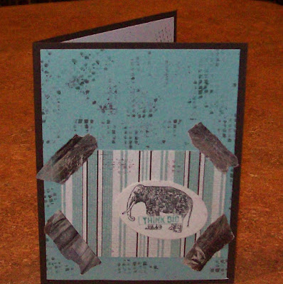
Here's the final look of my card. I sponged Tempting Turquoise along the edges. I framed with black and used a sheet of Kraft embossed in the Square Lattice ef as my base. I stamped the sentiment in Versafine Onyx
 Here are earlier attempts.  I had an ancient pen in my stash and when I tried the technique it seemed completely purple and pink instead of having any blues/greens like in the video. (She did say that the colors have changed in the newer pens and mine was definitely NOT new!)
Well, I loved the technique so the next time I was in a craft store I whipped out a coupon and bought a set of the Elegant Writer Pens. They are meant for calligraphy and are black pens (they sell colors but I haven't tried that out yet) but because they are water based ink, when you activate them with water the colors separate out. My next drawing was of rocks and then I went back and watched the video again and drew a scene very similar to the one she had sketched and used for the tutorial.

I realized later that it looks like 2 bunnies, but I drew rocks!
On this one I'd watched the video again and added the color on the rocks from the bottom going up. I also used the new pen on this.


This is almost all color just from the one black pen!I sketched the flower then activated with water. I added a little Sahara Sand to shade around the flower and in the stem. I also used a purple marker to add in some detail to the edge of the petals.
I watched another video and got the idea to use a stencil for my next trial.
I taped down my stencil over a piece of watercolor paper and used my pen to outline and fill in the image.
Here's what it looks like as you start to activated the ink. I used a larger brush and wet the area around the image with water, then put the edge of the brush against the outside line of the image to start the process. I then stroked outward to spread the color around.
Here's the before and after. Once you have the image how you like it, take a fine mister and spritz from above the image to let a very fine mist land onto the image. This will just barely activate the lines that you haven't activated yet and once dry, they will no longer be able to be activated so that when you go to color the image, you don't accidentally start a process that you don't want.
I used my grey Chameleon pen to color the plane. I went back with the black pen to fill in the gaps left by the stencil.
The leaves and fish are stenciled. I drew the heron, copying from a color page I found online. All are only activated with water. If you want more of the purple color, you take a tissue or towel and dab at the wet color. On the fish image, I had used a LOT of ink and then while it was wet I added pretzel salt.
Here's the heron colored with Chameleon Pens


Thursday, August 25, 2016

Lifted Illegibility


     I decided to try to mesh two techniques together and I'm really excited at how it turned out. I haven't turned this into a card yet, but I love the look and decided to share it now. 
     The first technique I described in my last blog post. I learned it from last week's Mixability Challenge where Lydia linked the fun tutorial for very loose, illegible writing as a bg. The second technique was featured a couple of weeks ago on splitcoast and it is called watercolor lifting. I have combined the two using distress inks and a liquid coffee that I sometimes use as a spray with my writing done using a Versamarker.
     I started off by smooshing several different Distress Inks onto some plastic packaging and adding water and dripping in some of the coffee liquid. I make this from instant coffee and water. (I guess I'm really doing 3 techniques because I know this one as Wrinkle Free Distress). I laid my paper, torn from a Mixed Media journal, down into the wet ink. Once that was dried, I did another dipping to intensify the color and dried again. I ran an embossing buddy over the whole sheet and then used my Versamarker to illegibly write over the whole sheet. If I remember correctly, I loosely wrote the lyrics from a couple of worship choruses on this one. I then embossed with clear ep.
As you can see, it is hard to see the writing when the whole piece is darker.
Looking at the top left corner you can see where I'm starting to lift the color and as the bg gets lighter, the embossed writing now shows up darker. MAGIC!!
Here's the final piece. I removed color from the whole piece. I poured out some of the coffee liquid into a dish and dipped an empty toilet paper roll into this to add the circles. I also spattered a bit of the coffee around too. Really fun technique to try out. Hopefully I'll either get it turned into a card, or maybe just add a bit as a journal page.

Secret Journaling

     Last week Lydia introduced me to a fun technique on the Mixability Challenge. She described it as "secret journaling" but it is basically a very loose writing that is illegible. Here are a few pieces I made using markers on plain white paper and onto some previously made watercolored pieces.
 I quickly became obsessed so here are a few more cards I made using cut up pieces of the writing. 


All the details for each card can be found at my splitcoast gallery where I'm known as mamaxsix.