Pages

Tuesday, April 30, 2013

Let's Hear it for Moms and Dads!

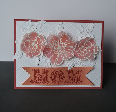
Trying to get ahead of things with cards for Mother's Day and Father's Day for the shop where I sell some of my cards. Here's a few using last week and this week's color challenge combinations from splitcoaststampers.com. I love having part of the work done for me and the gals there put together some beautiful combos!

Embossed the vellum with white ep then watercolored with a wet brush dipped into ink on the lid of my Primrose Petals and Calypso Coral ink pads.

Both card featured scoring done on my Diagonal Scoring Plate. I layered 2 different flowers on this one.

Last week's colors were Baja Breeze, Not Quite Navy and River Rock. I love the way the punched pieces fit into the stamping on this one.


These colors are similar, but I was playing around with the technique for the TLC yesterday to make your own chevrons. Don't look too close or you'll see how uneven my cutting is! Night of Navy, Not Quite Navy, Island Indigo and Bayou Blue are the blues I mixed and put onto a Crumb Cake base with a Whisper White bg.


Friday, April 26, 2013

Add A Squiggle!


Today's splitcoast Mixed Media challenge was to add some squiggles by doodling onto our cards. Here's my final card

I doodled in white gel pen and also with my Not Quite Navy and River Rock markers. I also added some water color pencil shading around the leaves and under the popped flower as well as on the edges of the panel and framing panels, and I used a blender pen to soften these.


My barnboard started with River Rock direct to the paper


Next step was to add Baja Breeze
Last ink was Not Quite Navy.

I didn't like the look so I liberally spritzed it with water to blend the colors together more.

I took my Not Quite Navy marker to add some more detail to the "wood" and to the sentiment punched pieces along with some white gel pen accents.

Monday, April 22, 2013

Variations on an Inspired Theme

I didn't get a lot of stamping time last week, but I've already made up for it a bit the last couple of days. I love the inspiration challenges on splitcoaststampers.com where we dive into different websites for inspiration. I found two pieces that really fired me up: a toffee colored textured pillow and a repeated fern on linen pillow. My first card combined the two pretty literally 
My Soft Suede piece is embossed with 3 different folders (I actually debossed the circles by mistake) and is sponged a bit to highlight the embossing. The image piece is stamped and sponged with Suede for the canvas look and the ferns are stamped in Handsome Hunter.
This time the ferns were stamped in Gumball Green onto River Rock with some of the ferns stamped off first. I also added some sponging around the edges, sentiment piece and onto the embossed Vanilla bg. This card uses the sketch from today's CAS challenge
This time the texture is on the image panel. I stamped the ferns in Always Artichoke onto River Rock then embossed in the Square Lattice ef. The detail got lost a bit so I sponged some more Artichoke over the ferns and added a bit of Suede sponging along the edges. The base and sentiment piece are stamped with an old favorite, Weathered. I rounded a couple of corners to echo the curves on the punched piece and wrapped a bit of linen thread around the image panel which is framed in Suede with the edges distressed.  

This is the same sketch flipped to a horizontal orientation. I actually made this card after the one that follows as I really liked the look of this branch and flowers on the vertical panel. This one has silver liquid pearl accents and stapled natural trim loops.
Here is the split panel layout that inspired me to use the flipped sketch for the last card! Another stapled ribbon loop look here as well as some glossy butterflies with gem accents and I added silver to the edges with my stampin' dazzle marker. This card is a CASE of AnniePanda's pretty four panel card
Well, there you have it-this is how my brain works with ideas cascading into other ideas! If you want more details on materials used you can check out my gallery for the info.

Wednesday, April 17, 2013

Give Your Burdens

Ever have one of those times in your life where everything just seems hard. We've just been dealing with some hard stuff lately. I picked up this verse stamp a while back but had put it in with some other stamps and forgotten about it. I'm plugging away at organizing my stamping area and came across this verse that really spoke to me today. I took the card sketch from today's sketch challenge on splitcoaststampers.com and used it as the basis for my framed piece. 


I thought about another umbrella man die cut that I already had sitting on my desk, but then this other one cut from a leftover piece caught my eye instead. I wanted to use the mask to form a puddle/reflection but had to reverse the sketch as my piece was cut in this direction. It also had to be done on the vertical due to the size of the die cut. Both the base piece and my die cut are made with dictionary paper coated in Gesso with the die cut piece using both white and grey Gesso as well as blue spray. My base piece was sprayed with homemade blue reinker spray that I then forced to puddle and drip down using a paintbrush. I sponged inside my reverse mask with Midnight Muse. I stamped my sentiment in the same and then threw the clear ep over that while it was still wet and embossed the sentiment. I went back and added some more sponging to try to bring the words out more clearly. I also sponged around the edge of my die cut for definition also. The frame (which was a glossy cs) was stamped with Midnight Muse also and then I sponged the edges a bit and that sort of smeared on that glossy cs.


Stamps: Print Works-Give Your Burdens
Paper: Dictionary Page, Night of Navy, picture frame glossy cs
Ink: Midnight Muse, blue reinkers
Accessories: Grey and White Gesso, Spritzer, Sponge, Paintbrush, clear embossing powder, Tim Holtz Umbrella Man die
Techniques: Reverse masking, Sponging, Tearing, Spritzing, Embossing

Tuesday, April 9, 2013

Following Trends

I'm not the most trendy of gals usually, but I do have the chevron and honeycomb embossing folders, some die cuts from the Spring catalog and I just picked up some of the Natural Trim ribbon which is similar to burlap. So when today's color challenge asked us to use trendy items I was good to go! 
I used a couple of fun techniques here that I thought I'd share with you:  Stamp Kissing and Wrinkle Free Distress (modified to use shimmer spray).
I directly swiped my Calypso Coral onto an acetate sheet

Next step is to spritz with a homemade shimmer spray-rubbing alcohol with glimmer paint added in. You want it to really bead up on the acetate.

I then laid my glossy card stock over the ink and picked up the ink. Here's what it looks like after one dip in the ink pool!

I didn't add any more ink, but simply spritzed again.

Here's the final product. You get nice color variation and can even do more than one color either overlaid, or in separate areas on the acetate. You want to dry your card stock between layers to keep the colors more distinct. I cheated and used my heat gun because I'm not so good at waiting. ;)
I die cut the flowers then cut layers out. I took my piercing tool to curl up the edges a bit for some more dimension.

Here's how I did my leaves. I inked the solid image with Stazon black then stamped the Canvas bg over the ink to remove some. (With traditional kissing you actually stamp/kiss a second, darker color onto your solid image, but because I was using black, I decided to see if I could get the look be removing some of the black.)Then I was looking at the inky leaves right there on my Canvas stamp so I laid my paper over the top and rubbed to pick up the "leftovers" and got the cool image you see on the left. I wish I'd been a little more careful to leave room between the two as when I die cut them, I ended up with a little missing bit on one leaf....ooops! In order to die cut the 2nd set of leaves I had to put the die on the back side as the image is reversed. I held the paper up to a light and positioned the die on the back side and used a piece of tape to hold it in place.
 All Stampin' Up products today!
Stamps: Secret Garden, Itty Bitty Banners, Canvas
Paper: Basic Black, Baja Breeze, Glossy White
Ink: Stazon Black, Calypso Coral
Accessories: Chevron and Honeycomb embossing folders, Bitty Banners and Secret Garden framelits, Natural Trim ribbon, Mini glue dots, markers
Techniques: Stamp Kissing, Dry Embossing, Omitting With Markers, Wrinkle Free Distress with shimmer mist


Monday, April 1, 2013

Playing Around With The Chalkboard Technique

I love playing around with techniques and the chalkboard technique is a really fun one. It works great with big sentiments and is an easy focal point for a CAS card. You stamp in either Versamark or White Craft ink then emboss with white ep. To add to the effect, sponge on some extra white craft ink to look like smears on a chalkboard! Hope you have fun playing around with this technique-I know that I sure did!